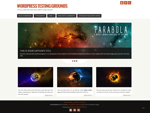
You probably haven’t been waiting for it that much but nevertheless here it is. The newest Cryout Creations theme is finally available for download. We’ve tested it as much as we could but it’s still practically a beta until you guys get a go with it.
Parabola is pretty much a Mantra offspring (and that can only be a good thing, right?) and quite a few things have changed (to be read ‘improved’). We went for a more mathematical design – thus the name of the theme – and changed the settings page quite a bit. But don’t worry, not only are all your favorite options still there, we actually added a lot more.
The biggest change comes with the color options. Now there are over 40 color options that we hope will fix all your customization needs. We’ve added more font options and 10 more font families to choose from. You also have a few more options for the social icons and the whole header section that in the meanwhile has been implemented into Mantra as well.
We’ll let the theme do the rest of the talking for us so feel free to take it for a spin. The theme is just as free as Mantra is and the support will be the same (the forum section for it has been live for a while now). We’re looking forward to getting feedback from you guys, especially about the new color options.
As it is currently pending review for inclusion in the WordPress theme repository, Parabola is not yet available for automatic installation. But you can follow our installation tutorial to get it live on your website. Have fun with it!
Update July 8th: Parabola updated to version 0.9.3.


hi guys great theme any one know how to change twitter Facebook you tube icon to your own color as i can change all the one color across all icons any help would be great thanks in advance
This is not possible as the icons are image-based. You can change the background, however, using custom CSS for each icon.
I am impressed with the Parabola theme and am building a site with it (http://www.craftedcopper.co.uk/wordpress/).
One thing that I cannot seem to do and wonder whether anyone can suggest a way of doing: the title has the telephone number and company name on the same line. I wish to keep this, but have a larger space between the two and make the font on the number smaler.
Is this possilbe and, if so, how can I do it?
Thank you.
James.
As you cannot type HTML in the title field in WordPress, you cannot separate the title and the number to control them separately via CSS. One approach would be to use the pseudo
#site-title span a:after { content: "PHONE"; }CSS to add the phone number after the title via CSS (and customize it accordingly), but this would mean it is no longer present in the source of the page and not visible to crawlers.Thank you. I shall have a go and see how I get on.
Regards,
James.
I really love this theme. The only caveat I have (maybe it has a solution, that’s why I’m asking) is that I can have an “older posts” link at the bottom of the page unless I deactivate the presentation page, which is ok, but THEN the slider stops working…
Do you have any suggestion to keep both functionalities?
Just downloaded your theme and it seems great. The drop-down function in the main menu doesn’t seem to work for me. My site is:
http://www.pharmacoinformatix.com/
The “Drug Info e-Resources” in the main mene is defined as a parent page for three other pages, but they don’t appear in drop down. Can you help me with this?
Thanks
I see you solved this.
First of all, I will repeat what others have already said. I love this theme, and have it installed on two sites.
However, I recently came across an issue, and I do not know if it is plug-in related or theme related. I have an image file that is loaded on my site. The site is “senewenglandtaxandaccounting.com”. Under the “About” key, there is a key for “Testimonials”. The picture file should come up automatically, but does not. At least not on my browser, or the technicians browser at Fatcow.com. I have optimized the site about as much as I can, and use W3 Total Cache to take care of housekeeping issues.
One other thing you may want consider for the theme, beyond what you have done in the area of “social networking” is adding your own version of the “plus one, like, share” plug in.
regards.
I believe you’ve inserted that image in a wrong way. Somehow it includes dashboard code and even links to your media section.
Check the source of that page, clean it up, and try to re-add the image using the Add media function.
dear ladies and gentleman, your theme is absolutely great!!
it is good to have columns on both sides of a side. but i am wondering, if it is possible to arrange the columns at the article area (my postings) in the same way? at the moment it is only possible to have the two columns on the right side in an article. but i would need one columns at the left and the other column on the right side, so that i can present my articles in the way i want to have them.
maybe you can help me please?
greetings
siegfried
Change the Layout option (under Appearance > Parabola > Layout Settings) to the desired configuration.
Hi…this theme is undoubtedly awesome…I am trying to use a custom header for the blog and a different style sheet for the blog. So could anyone tell me where is the link in the blog template to the css style sheet………….. thanks in advance
Hello,
Just wanted to say I love this Theme and it is working great for my site so far. I have one question: the author name and date don’t show in the articles and I have changed that function in the parabola settings area to show both and neither show up. I was wondering if I am doing something wrong or if there is a setting I can change to display author name and date on articles?
the site is http://thefootyobserver.com
Thank you
The author and date are part of the meta bar. When you hide the meta bar, everything in it is hidden as well.
Thank you so much.
I’m new to WP… Love your theme…
How can I get the background to flow all the way to the top… behind the header?
Thanks in advance for your help.
R
Leave all background colour fields empty in the theme settings.