
Nothing “extraordinaire”, just a small set of fixed and improvements, part of our (brand new and totally unconfirmed) semi-weekly updates release schedule.
The (relatively short) changelog:
- fixed categories displaying both featured images and content image when full posts are displayed
- fixed presentation page columns not fitting in one row on IE8 (getting sentimental about the past?)
- move all static css out of the page source and into the style.css making it replaceable by custom CSS
- fixed another tiny NextGEN compatibility issue
- fixed uppercase option not affecting the mobile menu
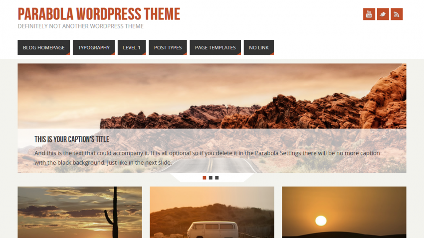
Using your Parabola theme for my final thesis due next week, but the slider did not work after the WordPress and your update. http://www.nurse-education.info
What the heck happened. My final grade is depended on the website working properly and is due Dec. 18. How can I fix ASAP.
You have a JavaScript error related to jQuery. I see the Page Transitions plugin you are using is loading its own (very old) jQuery version. Disable this plugin and see if that solves your issue.
Template is broken with the update 1.1 and 1.1.1.1 too. No presentation page …
Wordpress 3.6.1
Hello!
After update, i have strange issue – sidebars doubles every widget added.
If I add PAGES and SEARCH – they appeared twice.
PAGES | SEARCH | PAGES | SEARCH
Some bug or I do something wrong?
Same problem here. I like the theme, but this must be repaired soon!
Sorry about that. We’ve already sorted this out and submitted the fixed update.
Is it possible to change the entire header into a flash animation? that will be active on every page of the site..if so what would you recommend i export it as, and the coding. You guys will blowup if you keep up the good work
please add bottom, top to general background position options good sir 🙂
at the meantime i’m using the custom css section to make the background set to bottom
You’ll have to ask WordPress to do that. Appearance > Background is part of WordPress, not the theme.
Hi!
About the columns of the presentation page…
They don’t play well with responsiveness (or I’m doing something wrong).
I’ve got 4 columns, which makes the width of each 218px.
When looking at a narrow screen (iPhone), the pictures get blurred since the responsive action seems to be to shrink them until 4 in a row does not fit anylonger, then 2 in a row is presented…but to fit the screen width the images are then stretched.
(and the same then goes for a screen like iPhone’s, which can’t fit two columns next to each other, but has more space than required for 1….the result is then 4 columns on top of each other which are stretched and blurry.
The slider on the other hand, which is only one, obviously get shrinked all the way, so that one displays really crisp.
(The stretching of the columns though not only make them blurry, it also makes them twice as large as the slider on a small screen (at least if you have a fairly low slider in height.)
Would be great if the columns didn’t re-align more than to two in a row when scaled down for a smaller screen, so that the responsiveness would shrink the images and thereby keep the crispness. (that would also look better size-wise in comparison to the slider.)
…or at least that there was an option to not let them allign one by one.
Cheers, and thanks for all the awesome work you put into this theme!
Oh, forgot: http://66.147.244.75/~strictq7/
Far from done, but…